Exam in one hour. I know it well enough, but it's a lot and I'm sure I will forget lots. And I suck at memorizing formulas. And I'm nervous, and not feeling all that great.


Exam in one hour. I know it well enough, but it's a lot and I'm sure I will forget lots. And I suck at memorizing formulas. And I'm nervous, and not feeling all that great.
Keep on keepin' the beat alive!

I guess hiring a pro to do your website doesn't ensure pro results no matter what you saw in their portfolio. I am pretty livid at the situation as it stands. There's been a huge lack of communication. So much so, that for three weeks I was repeatedly told my site was almost done. I reminded them I was going to a gem and jewelry show, and I needed my business cards. I got the cards in time, but what good are they when there is no website nor email address as listed? Finally I was promised it would been done friday night, the night before the show. all that appeared friday and saturday, was the godaddy default page. They had my cards printed PRIOR to reserving the domain name!!! Monday AFTER the show, they registerd my email address via gmail. For 9 days after the show when visiting my web address, I kept getting a "Heroku Error: That app does not exist" error. So today I email them and ask what is going on. I was told that for some reason the www wasn't being recognized in the name, but the site is up and working if you drop the www from the domain name. *ugh* I was also told that the host should have that fixed today. Which to me means they handled it today. They never bothered to contact me to tell me of this issue, prior to my email.
So I visit my site, all excited, and was sorely disappointed. They didn't implement any of the fancy things that I like from the mock up. I was told that the page would resize to keep all information visible, without the need to scroll. It doesn't! The site looks good on the iPad, in portrait orientation, but is horrible in landscape. You actually need to scroll left and right as well as up and down to see the whole page. In Windows IE, the page resizes, but remains suited to portrait orientaion, with the need to scroll. Some fonts they used don't show in IE, but do on the iPad.
I find it rediculous for an image gallery page to not be able to show the image and the description without scrolling. Also, the GUI promised for gallery navigation is not there. Instead there are little dots (in IE, squares on iPad) you need to click to navigate. No thumbnails (as I was first shown). Also these dots are too close together, and difficult to hit on a mobile device, let alone an indication of what you have already looked at.
The images are mine, and the text was lifted from my facebook page. The site looks like it is just a template, that anyone could have implimented. I could have built this site in Dreamweaver myself.
I am not sure what I am going to do, or what recourse I have. A big part of me wants to just tell them to stop, that we are done here. I can build a better site using Dreamweaver, frames, and tables, than what I currently see from them. So it looks like I paid a lot of money for a logo, and that's about it.
If you want to see the site, and tell me what you think...I don't want it tracked back here, so please type this in a new browser window:
wilkinson jewelry dot com
removing the spaces, and putting in the period.
Oh, and what really cracked me up was that you are taken imediately to the gallery, and the first page/image is my title of 14K Roadkill. LMAO Yeah, you can see some of the humor in my titles, and descriptions, but jeez, let people ease into it and not hit them over the head with Roadkill right off the bat!
Thanks for letting me rant.

It should be pretty trivial to make those changes you want... then again, the story you tell doesn't inspire confidence, so... well, yeah. Bummer, man.
FWIW, it looks really nice and elegant, even with the PacMan dot navigation and lack of a proper home/index page.
"I predict future happiness for Americans if they can prevent the government from wasting the labors of the people under the pretense of taking care of them."
"The tree of liberty must be refreshed from time to time with the blood of patriots and tyrants."
-- Thomas Jefferson: American Founding Father, clairvoyant and seditious traitor.

The dot thing is annoying, if I was someone of an older, less computer savvy generation I may not know to click on the dots. So that I would have changed. But I do like the look of the site other than that. And it's so exciting to have your own site, isn't it?
Well, there were "animated" or dynamic things that were shown to me in the mock up. One big thing, was under the top "banner" was to be a scrollable strip of small square thumbnails of the images. My interior designer even picked up on this, and we are echoeing it in my new showroom, as a strip of framed pictures of my work circling half the room. Tying the website into the showroom. The webpeople dropped that altogether apparently. I recieved no explainations of these changes. I hate the little dots, for the reason Cat said, and that on a mobile device I can't acurately hit the correct dot, and then it doesn't indicate what you have already see.Originally Posted by CitizenCain

Personally, I like thumbnails. you are more likely to attract more views of work if the viewer can get a hint of what they will see, as opposed to clicking blindly. If they see 3 things they aren't impressed with, they are likely to stop looking!!!
It is supposed look elegant, so I guess that works. LOL We are trying to have an elegant look, while maintaining a bit of my quirky character.
No, Cat it's not exciting yet. I was paying for something "impressive", and they aren't delivering.
2 days later, after sending a brief email noting my disappointment, I have no response.
<myopinion>the animated/dynamic stuff was likely, in their minds, going to be coded and done in Flash, and then they realized that the iPod and iPad don't do Flash, so now they don't have an inkling of how to do it any other way, because even their javascript seems to be borrowed from other people, and are stalling for time until either a) you give up, b) they figure out wtf they can do </myopinion>
Edit: It also looks like they might not have a person who knows how to do computer graphics / graphic design, thus your lack of thumbnails.
Edit #2: My suggestion for a change: Those dots that you use for navigation? Create another bar below your image (like the one you have on top for the main navigation), stick those in it horizontally. Stick a left arrow on the left side, and a right arrow on the right side. Clicking them gives you the previous and next page for that section. Also include a javascript that listens for keyboard input, mainly from the left and right arrows. Have that do the same as the above. Have it setup so this javascript doesn't load in mobile browsers (at least not the iPad and iPod). Stick the text below this new bar. There, its now more streamlined.
Last edited by Illusions; 08-31-2011 at 11:08 PM.
. . .
It doesn't look horrible, but on my laptop it comes out just a tad too big for my screen which makes moving around a bit arkward.
Well, from the get go, we were all against using flash. Maybe they lost their good coder?
Haha, well, it's a company of 5 people, and I was quite impressed with their work displayed on their website and offline portfolio.Edit: It also looks like they might not have a person who knows how to do computer graphics / graphic design, thus your lack of thumbnails.
When I go home tonight, I am firing them. Isn't this your field, Illusions? I am PM'ing you.Edit #2: My suggestion for a change: Those dots that you use for navigation? Create another bar below your image (like the one you have on top for the main navigation), stick those in it horizontally. Stick a left arrow on the left side, and a right arrow on the right side. Clicking them gives you the previous and next page for that section. Also include a javascript that listens for keyboard input, mainly from the left and right arrows. Have that do the same as the above. Have it setup so this javascript doesn't load in mobile browsers (at least not the iPad and iPod). Stick the text below this new bar. There, its now more streamlined.
@Hazir, no it's not horrible, except it is not at all what we discussed. I have an issue with exactly what you see as far as size. It is my belief, for a gallery containing an image and a comment, there is absolutely no need to have to scroll in any direction. The page should resize well, and all be visible. This was exactly how I was told it would be. We were all on the the same page for what I wanted. But I wanted a slick hook, a gimmick if you will, to make the page a little more dynamic, which they showed in the mock up. I have dreamweaver, I could have made that site. That's why I went to a "Pro" to do something I couldn't.

Bitter, it must be fairly bad if you wrote so much about it.....I liked it better when you had tons of posts in the Happy and Pictures threads. Cakes to Kites, Glass Blowing to Koi ponds, kitchens to bookcase design, going out on a limb to create your own jewelry---such beautiful pieces of art. You're one of the most talented and prolific artists, and it messes with my groove that you're posting in this thread.
Well, my sons have their custom-fitted suits, hanging in my hall closet. New shoes, belts, and neckties. They made nice choices, they have good style taste. Youngest had his 3 1/2 year orthodontia ordeal ending a couple of days ago, with a truly beautiful metal-free smile. I finally paid off the $5,000 bill for that gorgeous smile. My best friend is flying into town for the wedding, and we'll be able to hang out for a couple of days. I might be able to see Paw Paw without the hordes of other ex-family around.
It all sounds like it belongs in the Happy Thread. But it's messing with my groove in so many ways. Paw Paw has Alzheimer's, it's too awkward to meet with my ex-family, our friends are either from HS or as shared adult relationships, our kids don't like their soon to be step mother.....
and this whole parade is within a mile of my home. This home that's become my prison, waiting for the day until I can break free and leave this town, get out from under the shadow of my ex, his circus behavior and his new clownish wife.
Three more years, and counting. Seems like a lifetime....
Well, GGT, things are good overall. I posted yet another record breaking month.
It's just funny how anytime I pay someone else to do something, there are always problems.
Remember my new windows issue? Or the people who installed my roof didn't install the ice guard correctly, or lip the last shingles enough, so we water is going behind the gutters, and making icicles down the side of the house, and I am sure, behind the siding. The guy that installed the new walls for my show room, fucked it up as well, and I have another guy coming to fix it. The guys that refinished my floors, did a nice job on the floor, but not the trim. It took my building (office) 3 months to install a 220 line for my A/C and we wont talk about the other work that needs done according to the lease, that now there is some contention about. I had custom things done to my new car at the dealership. They failed to do all the work asked, or do it to spec, AND broke a feature of my car. It's a pain for me, with my schedule to deal with this stuff.
So now, what's messing with my groove? How about getting T-Boned, by an uninsured, social security recipient on my way to work?
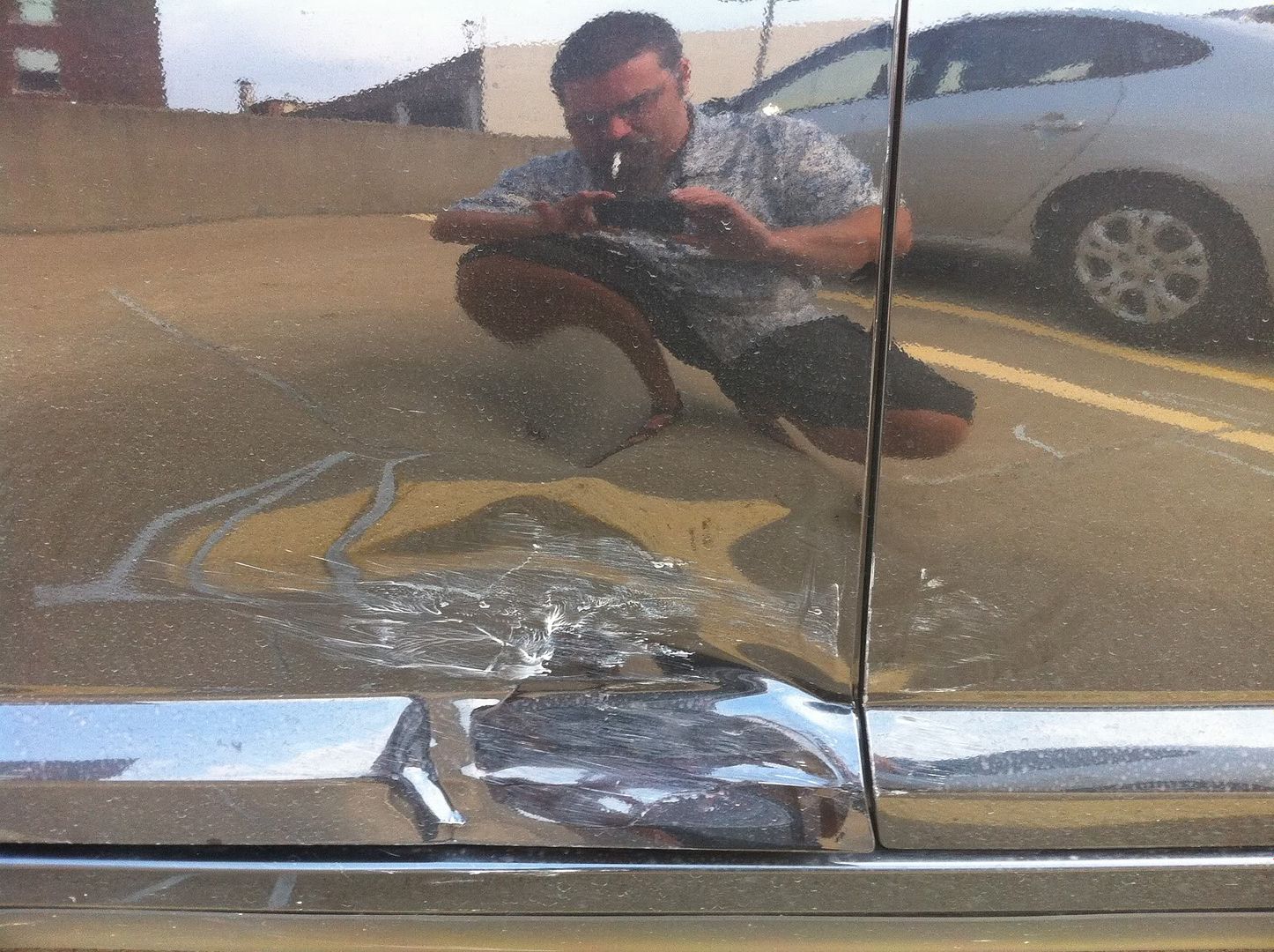


Those drivers suck, but when crap like happens I end up more pissed that it couldn't have happened a few inches sooner. You where this close to not having to fix that 2nd door
"In a field where an overlooked bug could cost millions, you want people who will speak their minds, even if they’re sometimes obnoxious about it."
Yeah, OG, the whole way the world works thing sucks...if I just took 2 more sips of coffee before I left, she would have already turned before I got there. Or conversely, if I took two less sips of coffee I would have turned before she was at the intersection.

I take it they aren't allowed to be uninsured, social security recipient or not?
No. All drivers must [legally] carry insurance for personal liability... or we can use a large bond in lieu of insurance, but either way, it's a requirement for all drivers.
"I predict future happiness for Americans if they can prevent the government from wasting the labors of the people under the pretense of taking care of them."
"The tree of liberty must be refreshed from time to time with the blood of patriots and tyrants."
-- Thomas Jefferson: American Founding Father, clairvoyant and seditious traitor.

You could improve the site like 100 times by making those pictures less huge, so the actual content and the pac man navigation isn't below the page fold. And do a proper home page with some text telling people who you are and why they should come and buy some jewelry off you. When people come to your site, what they'll see is this:
No text, just a huge picture of a ring. You can work out by inference that you are a jeweler, but there's nothing to say what you are (maybe if they weren't paying close attention to the URL because they came from google, they might think you are a professional photographer or a person who really likes rings)? Next thing they're going to do is click the back button and go somewhere else, on the internet you have an incredibly tiny window of opportunity to actually make your pitch and capture the users attention, because everyone has a tiny attention span and your competitors are literally seconds away.
From your posts here I know that a) you're an awesome photographer b) you know a lot about what you do c) you like to write about what you do. I'd suggest putting those three things to use on your site.
When the sky above us fell
We descended into hell
Into kingdom come
Ugh, overslept for the first lecture of the semester. But who the hell plans lectures at 8.45 on mondays
Oh well, it was videotaped so it should be online within a day or so
Keep on keepin' the beat alive!

You can also do something like this: https://www.tumblr.com/, where the center image is repositioned/resized, depending on the browser window size. It's not that difficult to do, about 4 lines in jQuery
When the stars threw down their spears
And watered heaven with their tears:
Did he smile his work to see?
Did he who made the lamb make thee?

Texas is on fire. D:
Second picture was taken near my university. All the counties nearby are strapped for manpower and have started asking for ex-firefighters to volunteer their time to help control the wildfires.
Your search had no results.
That looks scary.
While at work, the vacuum in the cyclotron suddenly increased by a factor of ~20, causing alarms to go off and the current to drop massively. Turns out that somehow both cryopumps failed simultaneously.
Keep on keepin' the beat alive!

Hope is the denial of reality

Carthāgō dēlenda est
How is this playing out in Latvia? I know Skrastins was one of the best Latvians to ever play hockey (in the NHL anyway). And I believe there's a KHL team in Riga.
Hope is the denial of reality
Working two jobs to pay the rent is really messing with my groove, my health, and everything else for that matter. Having to use PTO days just to catch my breath and spend a little quality with the family, or read a handful of posts here ... just another day in paradise I guess.
The worst job in the world is better than being broke and homeless
He was indeed. It's a tragic loss. A commemorative gathering of hockey fans was organized earlier this evening - sadly, I couldn't attend it as I only found out about the disaster when I got home, and the meeting was already over by then.
Carthāgō dēlenda est
Real shame, losing a bunch of talented hockey players... plus I'm thinking it's gotta be awful for the Russian pro league (not to mention that teams owners and fans), losing a whole team in one swipe.
And even in Russia, how the hell does something like that happen? A plane hitting a radio mast??? WTF????
"I predict future happiness for Americans if they can prevent the government from wasting the labors of the people under the pretense of taking care of them."
"The tree of liberty must be refreshed from time to time with the blood of patriots and tyrants."
-- Thomas Jefferson: American Founding Father, clairvoyant and seditious traitor.
The air travel industry there is pathetic. The planes aren't properly maintained, the airports aren't properly maintained, and many of the pilots aren't properly trained. I'd say this might make the people wake up, but that would be too optimistic.
Regardless, this is a sad day for hockey.
Hope is the denial of reality
Sorry rummie, that sucks, on so many levels.
Makes me feel like a whiny brat to admit it's way late on a Saturday night (Sunday morning by now) and my biggest complaint right now is nobody else posting in a sloshed state, besides me.
God dammit. Someone jumped in front of my train, so I'm stick in a hot train, filled with annoying school kids.
 Posting Permissions

 Reply With Quote

